
|
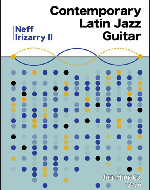
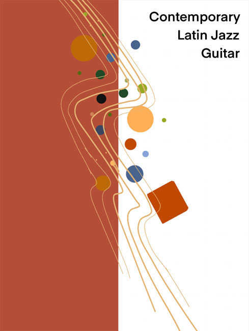
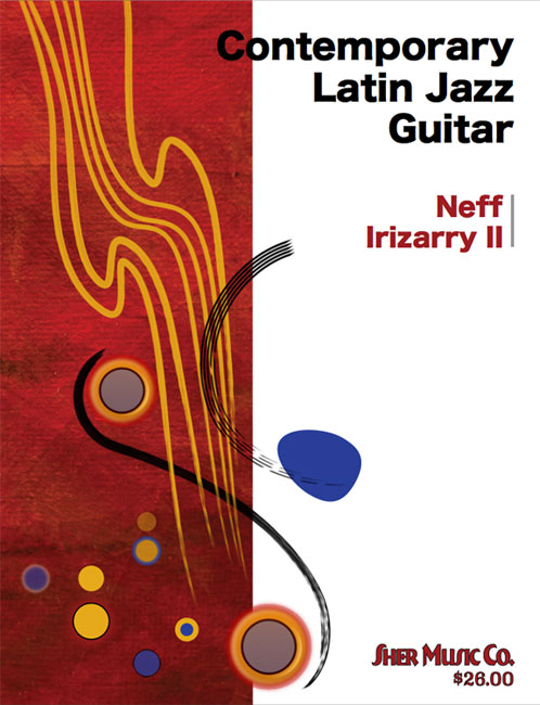
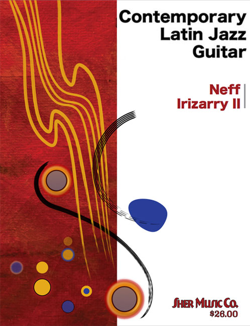
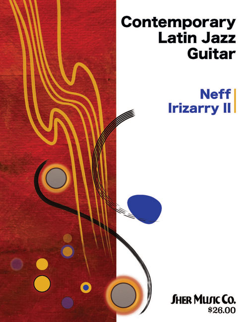
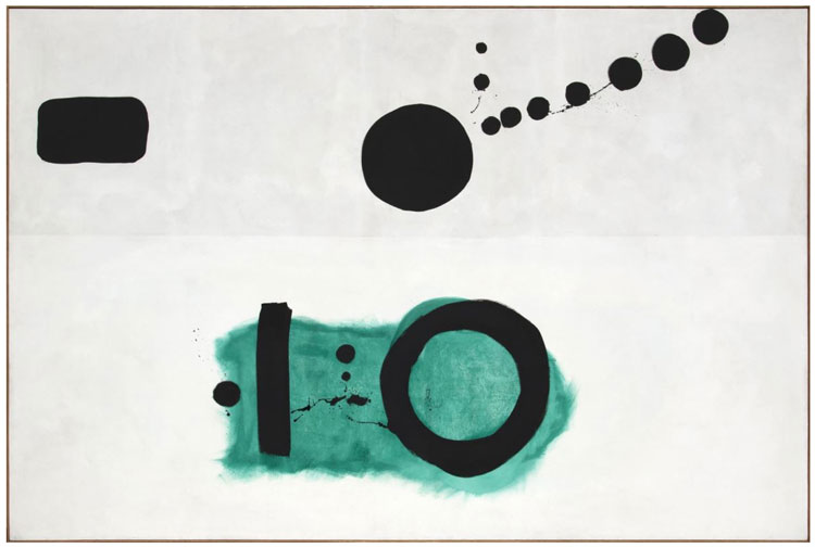
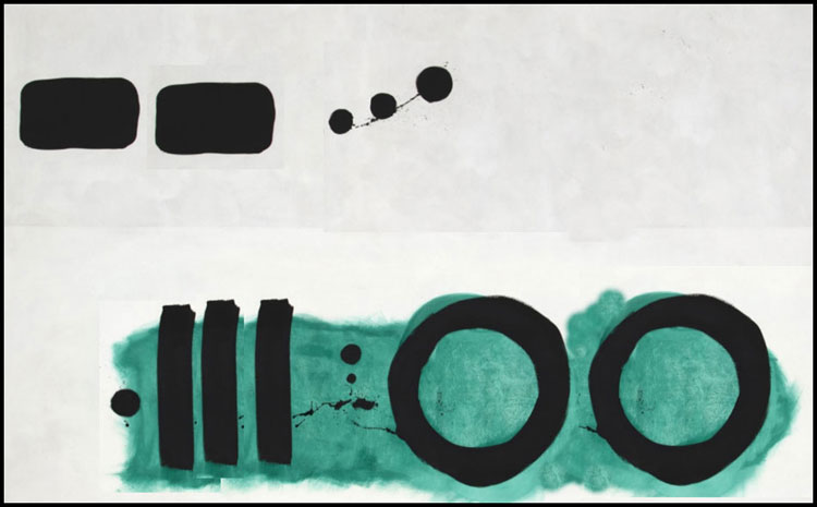
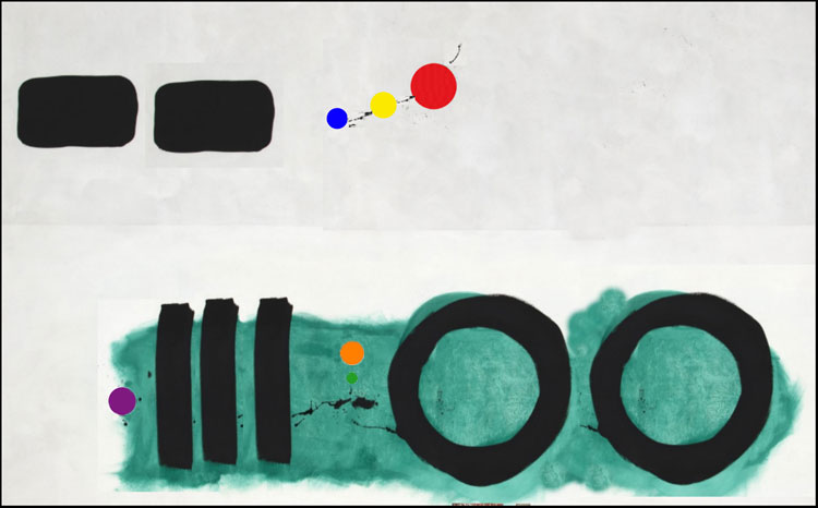
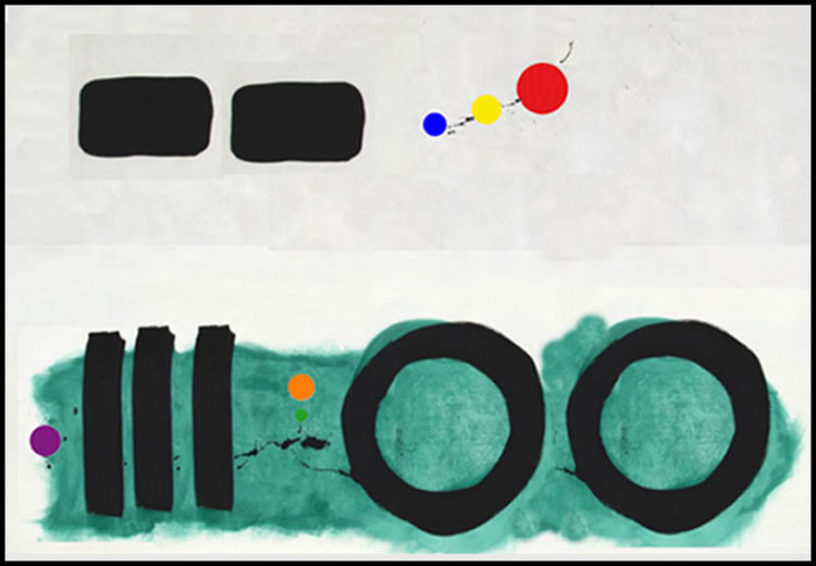
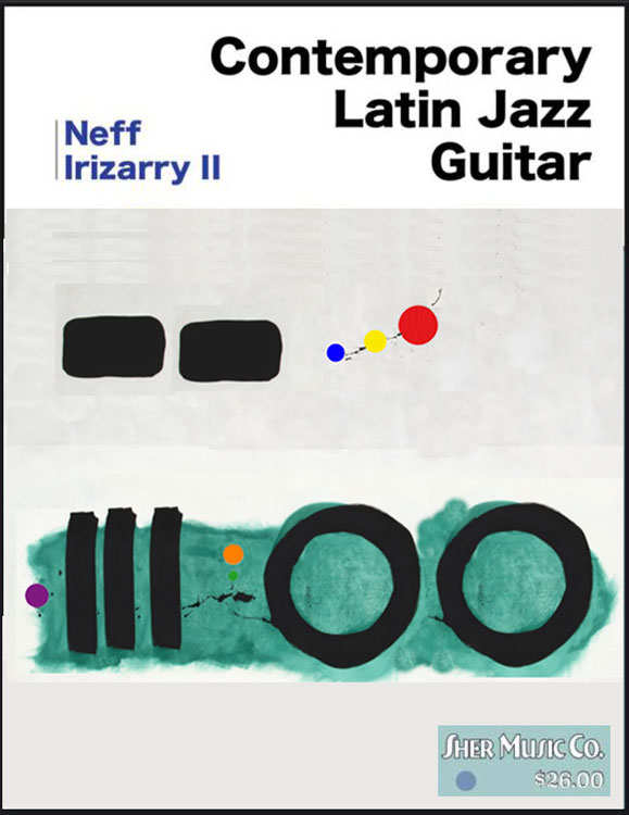
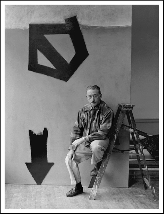
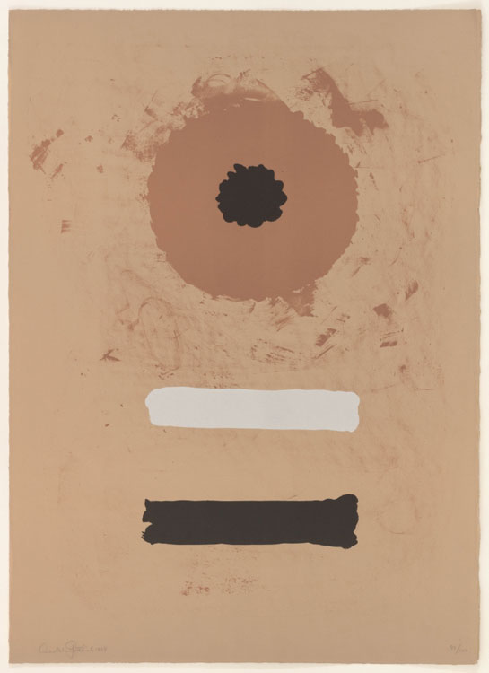
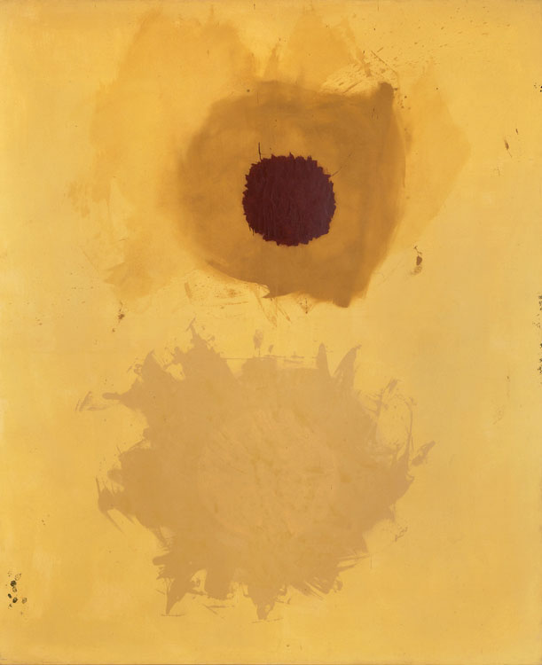
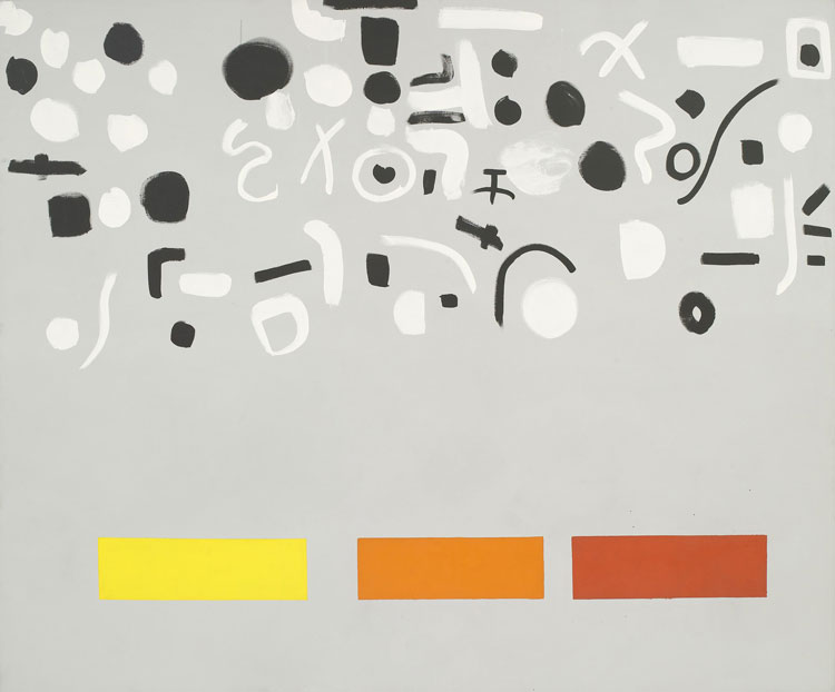
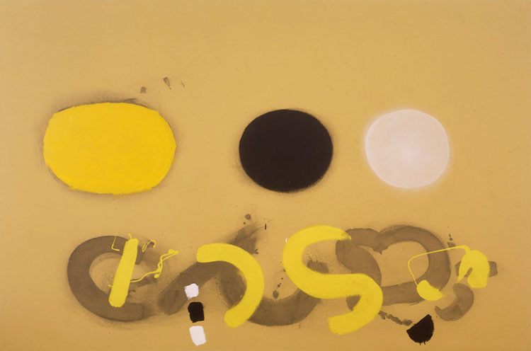
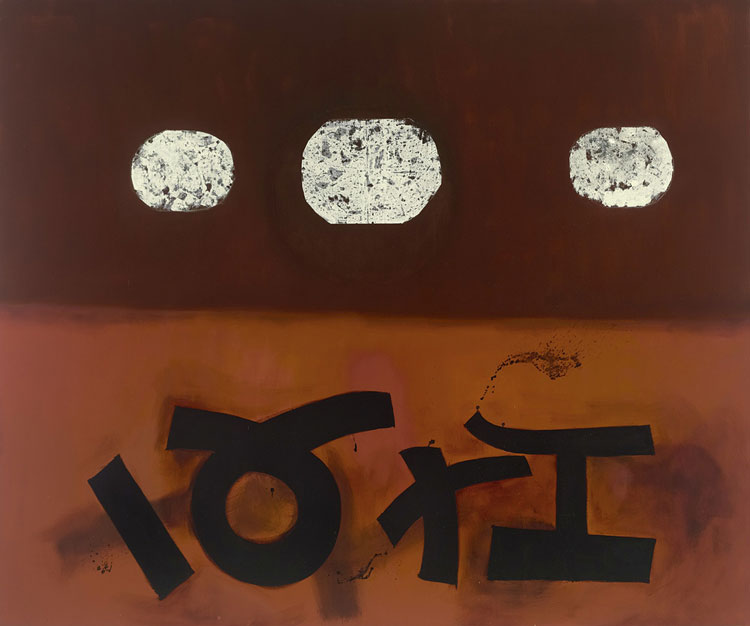
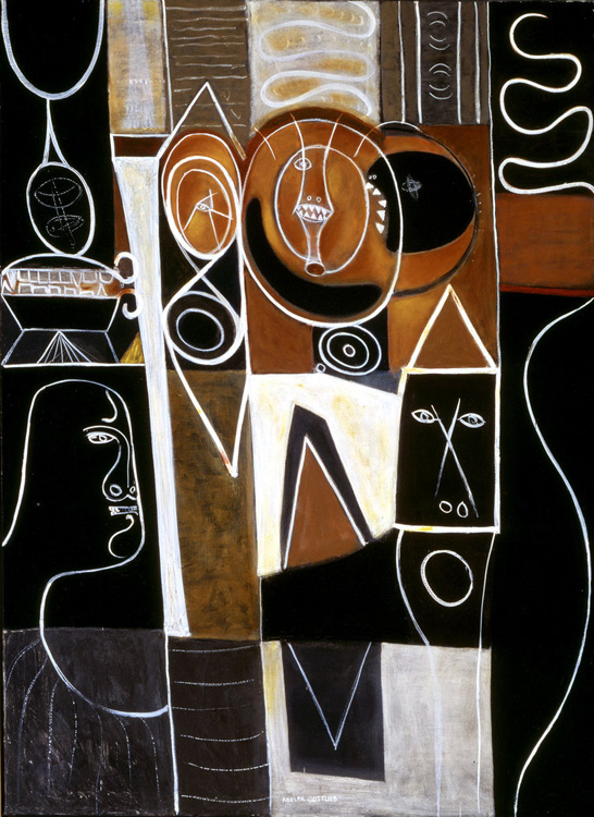
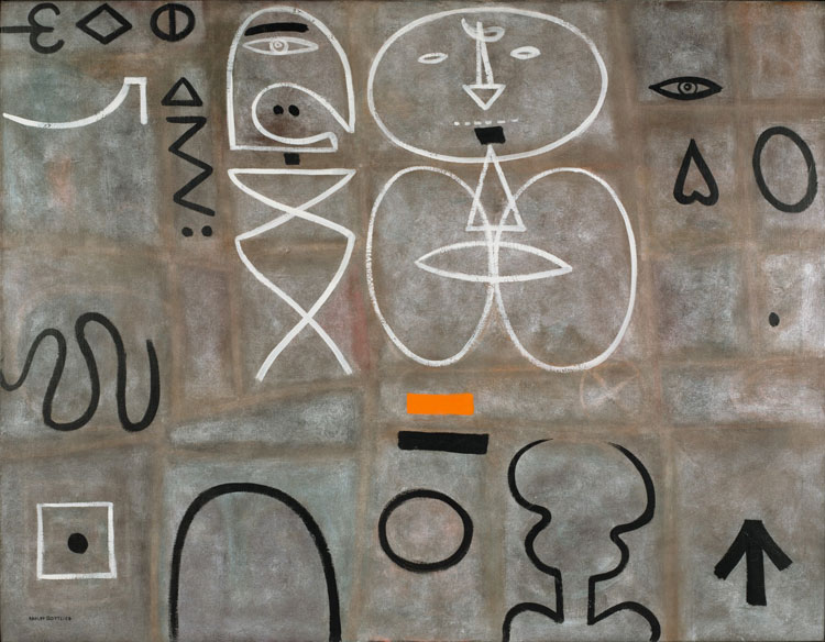
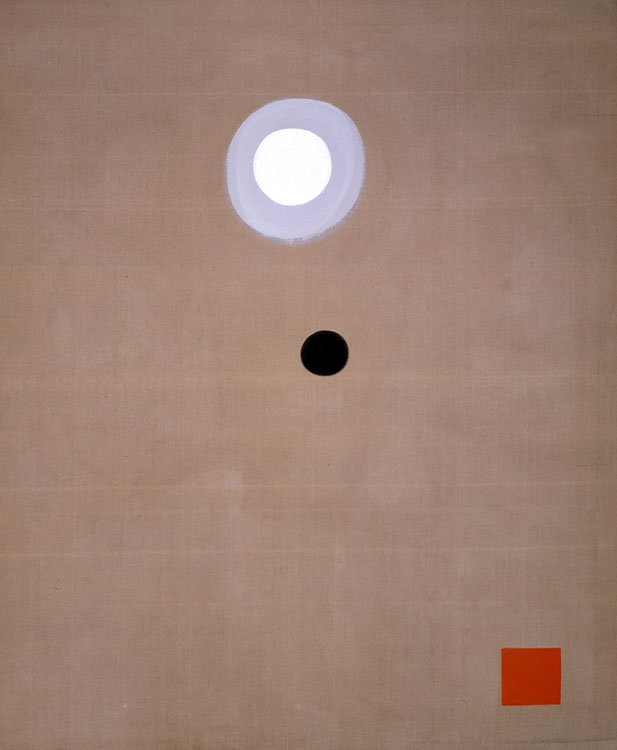
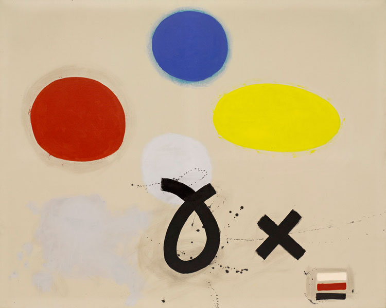
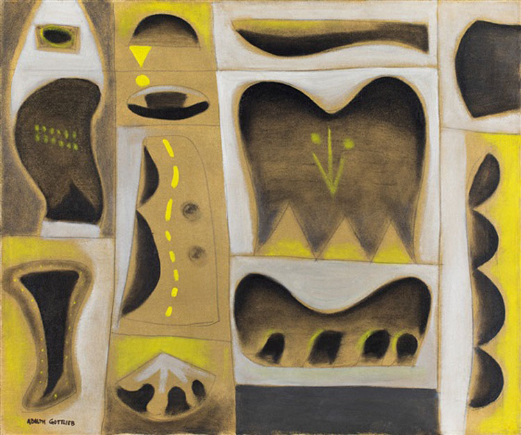
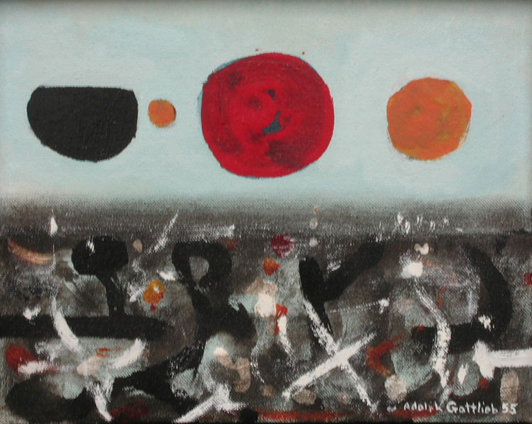
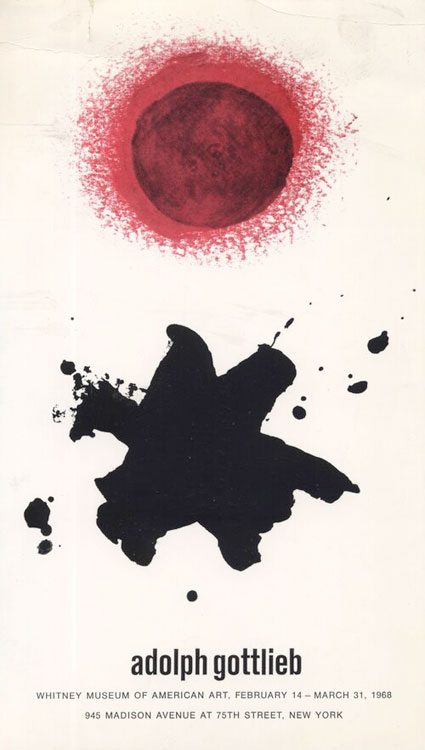
Let's face it, the covers and cover 'art' for just about all instructional or educational music books are all simply awful looking. When I see them, one simple phrase comes to mind: "Save Money!" By this I mean that the publishers are guided by one principle, and that is to cut corners, saving as much money as is possible to enable them to publish books. So, whereas the content of those same books might actually be really excellent and helpful for generations of students, why do these books have to look so awful? And so, with that in mind, we come to case of a former attendee of my brief artist-in-residence tenure at the prestigious Berklee College of Music in Boston during early 1994, I am speaking of guitarist, now published author, Neff Irizarry. His book will be titled, "CONTEMPORARY LATIN JAZZ GUITAR," and I am honored to be featured within the text and musical examples. It is a very serious and scholarly work, and that is undeniable! At various times during the process of nearing publication, Neff has consulted with me, seeking my advice and counsel about any number of significant issues. I have tried to be as helpful as I can be, but there comes a moment where one can only do so much. Neff was, in my opinion, incredibly fortunate to have secured a book deal with Chuck Sher, who has published some really tremendous books. As the publication date is near, Neff sought me out again, this time to ask me what I thought about the first cover design that they had sent him. Neff did explain to me that he had sent Chuck and his graphic designer-in-chief, Chris four examples of the kind of artwork that he would like to see beneath the title. As I never actually saw/read the manner in which Neff communicated his wants and desires where artwork was concerned or color concepts, etc. - I don't know how well he expressed what he was hoping to see. Anyway, he wasn't happy enough with the first version that he was sent, and then, communicated again asking for artwork that was less busy, a bit more minimalist, with perhaps brighter colors that might reflect the spirit and joy of Latin music. After some further back & forth, he received a 2nd version of the cover, and though he was "happier" - he was still not truly "happy"!!! Of course, I gave him my opinions on both of them!!! On or before the weekend of July 23rd, Chuck Sher sent Neff a 3rd version, which Chuck was very happy with, but as you can see, the type for the book title runs over into the area of image graphic - which does the obvious of having 6 strings morphing around, plus a blue shape that resembles a guitar pick. All such things are going for the all-too-obvious - at least to me. So, just to try to help, I created an alternate type placement that would have everything on the right side in the white area. What will happen next? Who knows? And so, on my own, I began to think about what might get Neff closer to something that he could really be proud of and happy about. As fate would have it, I had been looking at the website for the Heather James Fine Art Galleries, and I stumbled upon Adolph Gottlieb's painting "Azimuth" from 1965. It was such a jolt of beautiful energy and it all served to remind of my absolute love for abstract expressionism - and for Gottlieb's body of brilliant work, which I immediately began to investigate anew. It was overwhelming. But I kept coming back to that one painting, and within it, I saw a way to make an abstract representation of the most important concept in Latin music, the clave, which usually comes in two basic forms, either in 2:3 or 3:2. So, looking in the lower portion of the painting, I saw a 'stick' and a circle and I asked myself: "What if there were 3 sticks and 2 circles that would then represent the 3:2 clave. I looked at the upper portion of Gottlieb's masterpiece and saw a single isolated rectangle, and several little circles going upwards in an arc, and I then asked myself: "What if there were 2 rectangles and I extracted 3 of the little circles and moved them closer together?" And so then, the upper portion of the image would become an abstract representation of 2:3 clave - and we would have covered them both. As Neff had been looking for some "brighter, more vibrant colors" - perhaps à la Dalí, Miró or Calder!!! I asked myself, "What if I could somehow give the little circles the primary colors - blue, yellow, red, maybe green and orange?" And so, even this most amateurish of designers, me, I did my best to represent all of this with my most modest Photoshop skills and tricks. I decided to use purple instead of green in the lower area of the artwork, but there is a little green one too - barely visible. And so, I tried that, and lo and behold, I felt that I was getting close to something!!! However, if all of this was going to fit within the dimension constraints of a book cover, I would have to make my creation a bit more compact. And so, I tried to do that. When that was done, I was finally ready to see if I could place this "artwork" within Neff's cover - keeping the simple graphics of the book title and his name - which I liked very much, because it was simple and clean. Then, I summoned all of my courage and sent my test cover to Neff, who now lives in Latvia. To my shock and amazement, Neff loved what I had done - and he submitted it to Chris @ Chuck Sher. My hope was that this would finally give Chris a more definitive sense of direction and if he could come up with an abstraction of the abstraction - then maybe Neff would be happier? You must understand that, what I had created cannot be used as is, because everyone would probably get sued by Adolph Gottlieb's estate unless a permission for usage was sought out. In one most cosmic touch, Neff noticed that the blue-green blotch of color, which quite by accident I had extended to create the space for 3 sticks and 2 circles, had ended-up, quite by accident, in the shape of the island of Puerto Rico!!! Neff is of Puerto Rican heritage, so, this is all even more fitting! If you scroll down, after having read this text, you can see the sequence of events in this wild process to arrive at a cover. The conclusion will be the final version of Neff's book cover. After that, I am presenting to you a most wonderful black & white photo portrait of Adolphe Gottlieb working on his classic painting, "Descending Arrow." The photo is then followed by an image of that very same painting. And then, you have only to enjoy a succession of some selected works by this great, great artist whom I just admire so much and find him to be so inspirational and humbling on countless levels. I hope that you will enjoy what you see and will become inspired and motivated too. - Steve Khan |
|
|
|
|
|
|
|
|
|
|
|
|
|
|
|
|
|
|
|
|
|
|
|
|
|
|
|
|
|
|
|
|
|
|